The Linkwise Reader is designed to provide a highly customizable, distraction-free environment tailored to your exact reading preferences. By tapping the TT icon located in the floating menu at the bottom of the screen, you open the Appearance menu, granting you full control over the visual presentation of your saved articles.
Appearance Modes
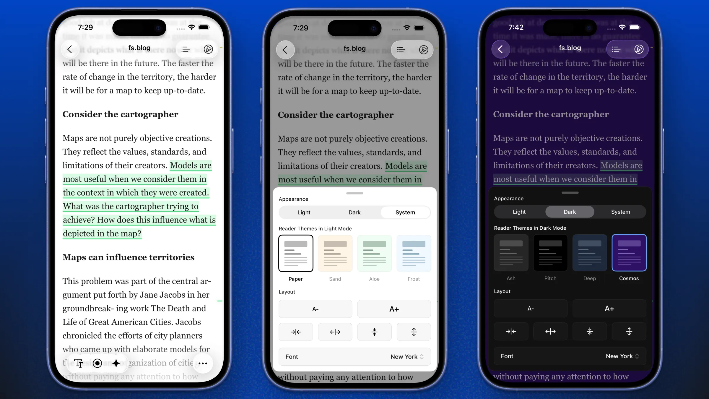
You can set the reader's base appearance to match your environment or device settings by selecting Light, Dark, or System.
Theme Selection
To ensure maximum legibility and eye comfort, Linkwise offers a curated selection of refined color palettes. The available themes dynamically change based on whether you are in Light or Dark mode.
Light Mode Themes Ideal for daytime reading, these palettes provide a comfortable, paper-like feel without harsh contrasts:
Paper: A crisp, classic white background.
Sand: A warm, sepia-toned hue to reduce blue light.
Aloe: A soft, muted green for a calming reading experience.
Frost: A cool, gentle blue tint.
Dark Mode Themes Designed to reduce eye strain in low-light environments, these palettes offer deep, high-contrast backgrounds:
Ash: A soft, dark grey that is easier on the eyes than pure black.
Pitch: A true OLED black for maximum contrast and battery saving.
Deep: A rich, dark navy blue.
Cosmos: A subtle, deep purple for a unique nighttime aesthetic.
Typography and Layout Adjustments
Beyond color themes, you can fine-tune the typography and layout from the same menu to suit your preferences:
Font Sizing: Use the A- and A+ buttons to quickly decrease or increase the text size.
Spacing and Margins: Utilize the alignment and spacing icons to adjust the margins, line height, and letter spacing, allowing the text to breathe exactly how you like it.
Font Selection: Tap the font dropdown (e.g., showing New York) to switch between classic serifs, modern sans-serifs, or the signature Linkwise brand font, Moret.